Read with Claude
 Read with ChatGPT
Photo by Levart_Photographer on Unsplash
Hola readers!!! Vanakkam Makkale!!!
So let’s begin with this… ahem ahem (clearing throat)…
Who loves cooking?? Or wanna impress your loved ones with your cooking skills?? 👀… This one’s for you…
This blog is all about my development journey with the GPT-3 API and Next JS. Of course, we have to think of a fancy name for the project that would suggest recipes, based on ingredients selected. Hence: “RecipeGPT”.
Fun note: My mum doesn’t have any idea of what she is gonna prepare for the next meal (happens always) and a lot of the time, she makes the decision based on ingredients available at home. So, I hope this might help her with some extra ideas to cook.
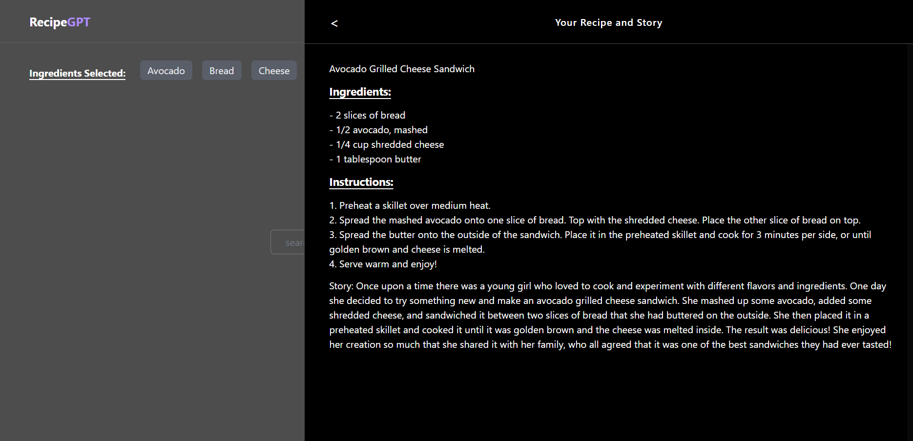
First, let me take you on a tour of what we are going to build now.
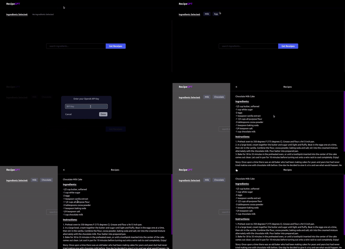 Since we are making use of the GPT API from OpenAI and access to free credits for the API is limited, I opted to have user enter their own OpenAI key to request a response.
If you noticed, I also added a slight twist in the end with an entertaining story around the recipe. You have not only a recipe to work with but a story to go with it (food for the belly and thought 😁).

## Project Flow:
- Users can enter ingredients and select from the list of ingredients shown.
- A limit of minimum one and a maximum of 4 ingredients can be selected. (I added an upper limit considering there will be at most 2–3 main ingredients in a dish🙂. It is easier to start with something simple and then, if required, we can modify this constraint).
- We get the OpenAI API Key from the user and then initiate the request to GPT API.
- The ingredient list will be used to create a prompt, which will be sent to OpenAI’s GPT API.
- The GPT API (our master chef 👨🍳) will give us a delicious recipe with the selected ingredients as a response.
On a future note🤔**:** we can save this response so that it will be helpful for the user and also reduce the number of requests to the GPT API. For this feature, we can use local storage or alternatively, set up authentication and backend. We will implement this feature in the next phase.
Tech Stack:
- NextJS
- TailwindCSS
Other dependencies:
- Openai
- Eslint (optional)
- React-hot-toast (optional)
Setting up a NextJS project
Following method is my go-to way of setting up projects. I prefer to use npm as the package manager. If you want to DIY: you can follow NextJS setup, TailwindCSS setup and GitHub repo setup, and feel free to skip this section.
- Create a new repository in GitHub (or any other platform) and copy the project repo link, which we will use for git clone. Repo link will be similar to:
https://github.com/<your_username>/<repo_name>.gitCreating a git repo allows us to add our project to version control from the start. Thus, you can maintain versions of the project and revert changes if required.
2. Open the folder where you maintain projects in your local machine and clone the repository.
git clone <repo_link>3. Go to project folder (with your repo_name, that was created in the previous step).
cd <repo_name>4. Create a NextJS project with typescript, by using
npx create-next-app@latest .5. Install Tailwind CSS by using
npm install -D tailwindcss postcss autoprefixer
npx tailwindcss init -p
5.1.Configure your template paths and add all of your template files in your tailwind.config.js file.
/** tailwind.config.js */
/** @type {import('tailwindcss').Config} */
module.exports = {
  content: [
    "./src/**/*.{html,js,jsx,ts,tsx}",
    "./src/**/**/*.{html,js,jsx,ts,tsx}",
    "./src/pages/**/*.{html,js,jsx,ts,tsx}",
  ],
  theme: {
    extend: {},
  },
  plugins: [],
}
5.2. Add the @tailwind directives for each Tailwind’s layers to your globals.css file. Remove all the CSS code in the file.
/** global.css */
@tailwind base;
@tailwind components;
@tailwind utilities;
6. Clean the project
a. Delete all the icons in the `/public` folder.
b. Delete the `/src/styles/Home.module.css` file.
c. Delete the `index.tsx` file and create a new `index.tsx`. Then, we can use rafce (react es7 snippet) to create a template component.
d. Delete hello.ts in the /src/pages/api folder. We will be creating our own API route.
7. One of the main libraries we will be working with apart from the ones that come bundles with the NextJS app is openai. Install openai by using:
npm install openai8. Add all your files to the git repo. Commit and push to the git remote repository.
git add .
git commit -m "Next project created"
git push
Data
We need a list of ingredients so that we can use this dataset to give users suggestions when they are searching in the search box and we will only allow users to select from the list.
The main reason why we are going with this technique is that if this restriction is not in place then users may mistakenly give wrong input and also we may get weird inputs for the ingredients, for example, we may get “Human” as an input for the ingredient. 🥲
To avoid these extreme cases, we can use a preset list as suggestions, from which users can select ingredients.
I used a dataset of 5000 ingredients in JSON format and here is the link to download the js file (I set it up as a constant).
Components
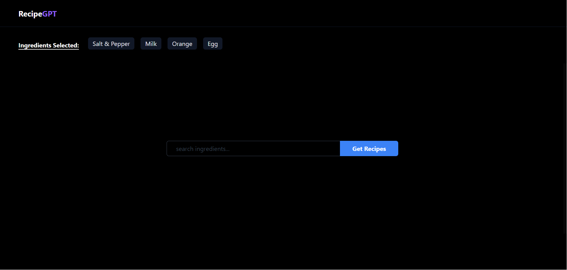
To get started, let’s first build the main components of our UI. We are going for something like the screen below with the following components:
- Navbar
- Selected Ingredients section
- Ingredients search bar (with autocomplete support)
- Results Flyout section
- OpenAI key prompt popup
 ### 1. Navbar
First we can start with the navbar. We can keep it as simple as possible for now, like this:
 Just a simple navbar with our logo on its left. Maybe in the future, we can have a profile picture or user’s name on the right (for when we bring in authentication).
const TopBar = () => {
  return (
    <div className="fixed top-0 left-0 w-full h-[10%] max-h-[70px]
    px-2 sm:px-10 flex justify-between items-center border-b-slate-900
    border-solid border-b-[1px] bg-black">
        <div className="mx-2 text-xl font-bold text-white">
            <span>Recipe</span>
            <span className="text-violet-500">GPT</span>
        </div>
    </div>
  )
}

export default TopBar
2. Selected Ingredients Section
Do we need to show the selected ingredients 🤔?
Yes of course, it improves our website’s user experience and basically it is a common sense too 😅. I added this section on the top of the page so that it doesn’t get covered by the dropdown showing suggestions.
 Once users select ingredients, we can show the selected list as shown in the below image.
 We have 2 main atomic components that make up the selected ingredients section:
a. Selected Ingredient Card

A card to show each selected ingredient with the option to remove the ingredient.
const SelectedIngredientCard = ({ item, setSelectedIngredients }) => {
    const [showRemoveButton, setShowRemoveButton] = useState(false);

    return (
        <div
            key={item}
            onMouseEnter={() => {
                setShowRemoveButton(true);
            }}
            onMouseLeave={() => {
                setShowRemoveButton(false);
            }}
            className="w-5/6 md:w-fit relative text-gray-200 mx-1 sm:mx-2 mb-2 bg-gray-900 py-1 px-3 rounded-md cursor-pointer transition-all duration-200 hover:bg-gray-800 hover:text-white"
        >
            {`${item.length > 30 ? item.substring(0, 27) + "..." : item}`}
            {showRemoveButton && (
                <div
                    onClick={() =>
                        setSelectedIngredients((prev) =>
                            prev.filter((i) => i !== item)
                        )
                    }
                    className="absolute top-0 right-0 h-[12px] w-[12px] -translate-y-1/2 translate-x-1/2 hidden md:flex justify-center items-center text-xs bg-gray-900 rounded-full transition-all duration-200 hover:bg-red-500"
                >
                    <span className="pb-1">-</span>
                </div>
            )}
            {
                <div
                    onClick={() =>
                        setSelectedIngredients((prev) =>
                            prev.filter((i) => i !== item)
                        )
                    }
                    className="absolute top-0 right-0 h-full w-6 flex md:hidden justify-center items-center text-xs"
                >
                    x
                </div>
            }
        </div>
    );
};
b. Selected Ingredient Section
This is the main Selected Ingredient component that brings together the Label and SelectedIngredientCard component and displays the list of selected ingredients.
const SelectedIngredient = ({ ingredients, setSelectedIngredients }) => {
    return (
        <div className="w-full md:h-[15%] px-2 sm:px-10 flex justify-between items-center overflow-y-auto">
            <div className="w-full flex flex-col sm:flex-row justify-start items-center">
                <div className="w-full sm:w-max text-center sm:mr-4 sm:ml-2 mt-5 mb-3 sm:my-0 font-bold text-white sm:underline underline-offset-4">
                    Ingredients Selected:
                </div>
                {ingredients.length === 0 ? (
                    <div className="w-5/6 text-center md:text-start text-sm sm:mr-4 ml-2 my-1 sm:my-0 font-bold text-gray-500 py-1 px-3">
                        No Ingredients Selected
                    </div>
                ) : (
                    <div className="w-full md:w-fit flex flex-col md:flex-row justify-center items-center">
                        {ingredients.map((item, index) => {
                            return (
                                <SelectedIngredientCard
                                    key={index}
                                    item={item}
                                    setSelectedIngredients={
                                        setSelectedIngredients
                                    }
                                />
                            );
                        })}
                    </div>
                )}
            </div>
        </div>
    );
};

export default SelectedIngredient;
Note: I had passed the setSelectedIngredients state function down to the child components for ease of implementation. For a more standardized implementation, it is better to create a global state that maintains and accesses the selectedIngredients in all its child components.
3. Search Box
Let’s move on to build our Search box, from which we will get input (list of ingredients) from the user. And this is also going to be as simple as possible, like this:

Users can enter ingredients and select from the dropdown. The main SearchBox component has
- an input field,
- a list of suggestions and
- the submit button.
const SearchBox = ({
    loading,
    clearSearch,
    onChangeInput,
    search,
    filteredIngredients,
    addIngredient,
    handleSubmit,
}) => {
    return (
        <div>
            <form className="w-fit flex justify-center items-center">
                <div className="flex items-center h-14 md:h-10 w-[300px] md:w-[600px]">
                    <div className="relative w-full h-full">
                        <input
                            type="text"
                            placeholder="search ingredients..."
                            value={search}
                            onChange={(e) => onChangeInput(e)}
                            className="h-full w-full py-1 px-6 bg-transparent border border-solid border-gray-700 -outline-offset-2 text-gray-200 placeholder:text-gray-700 rounded-md md:rounded-tl-md md:rounded-bl-md leading-tight"
                        />
                        <Suggestions
                            search={search}
                            filteredIngredients={filteredIngredients}
                            addIngredient={addIngredient}
                            clearSearch={clearSearch}
                        />
                    </div>
                    <button
                        type="submit"
                        className={`hidden md:block -mx-1 w-[100px] md:w-[200px] h-full bg-blue-500 hover:bg-blue-700 text-white text-sm font-medium md:text-base md:font-bold rounded-tr-md rounded-br-md z-10 ${
                            loading
                                ? "cursor-wait bg-blue-300 hover:bg-blue-300"
                                : ""
                        }`}
                        disabled={loading}
                        onClick={handleSubmit}
                    >
                        {loading ? "Loading..." : "Get Recipes"}
                    </button>
                </div>
            </form>
        </div>
    );
};

export default SearchBox;
You will notice a Suggestions component is used, which will help us handle the dropdown list of ingredients.
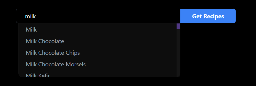
The dropdown is shown from the list of ingredients from the dataset that we had discussed about before.
const Suggestions = ({
    search,
    filteredIngredients,
    addIngredient,
    clearSearch,
}) => {
    return (
        <div
            className={`${
                search !== ""
                    ? "h-[150px] block opacity-100"
                    : " h-0 opacity-0 pointer-events-none"
            } absolute top-full left-[6px] w-[calc(100%-10px)] bg-[rgba(255,255,255,0.05)] rounded-bl-xl rounded-br-xl border border-solid border-[rgba(255,255,255,0.01)] overflow-y-auto transition-all duration-300`}
        >
            {filteredIngredients.map((item, index) => {
                return (
                    <div
                        key={index}
                        onClick={() => {
                            addIngredient(item);
                            clearSearch();
                        }}
                        className="min-h-[32px] max-h-fit px-5 py-1 text-gray-400 cursor-pointer hover:bg-[rgba(255,255,255,0.08)] hover:text-white"
                    >
                        {item.ingredient}
                    </div>
                );
            })}
        </div>
    );
};
4. Result Flyout
Finallyyyy!!! To complete our UI let’s add a flyout section to display our result (Recipe) like this,
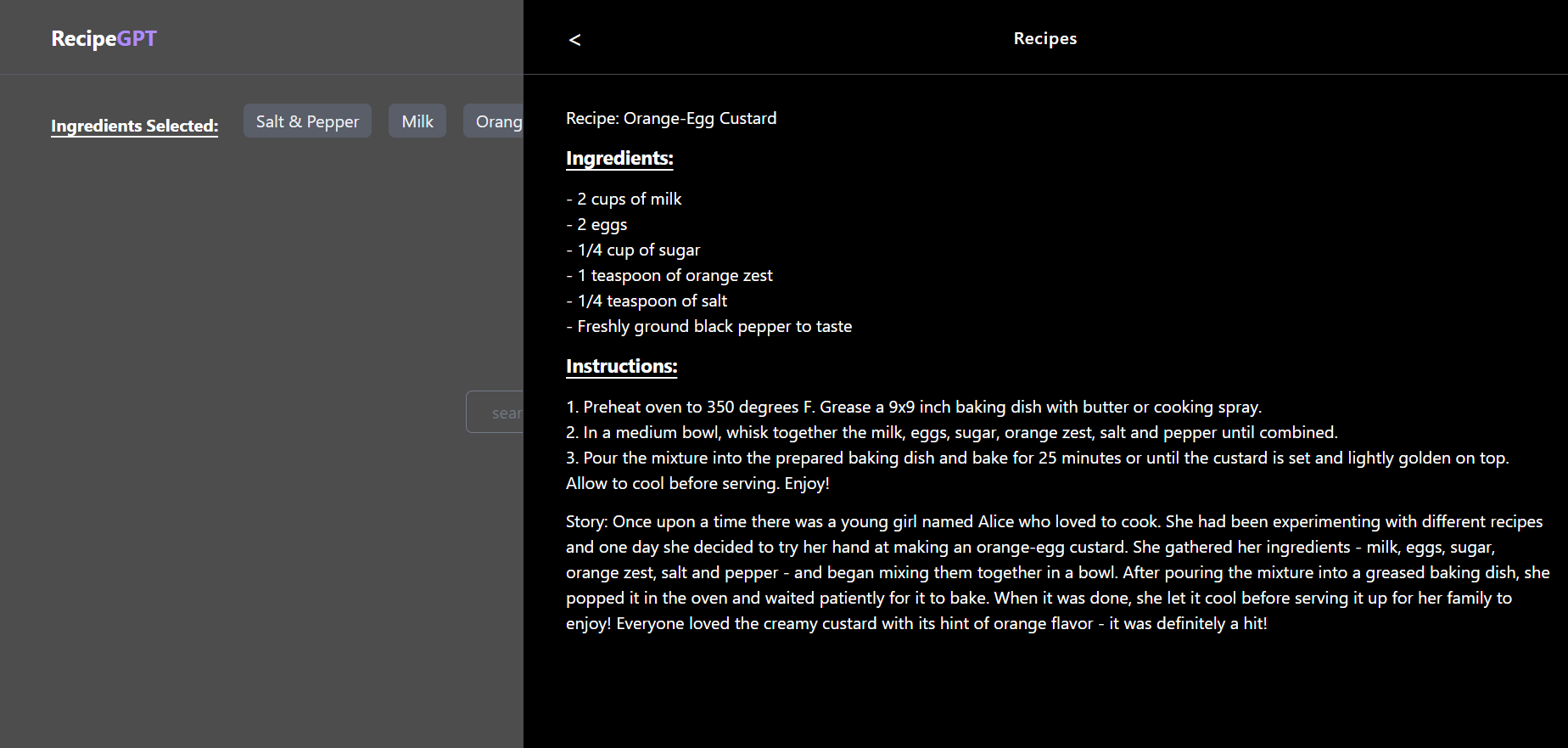 Our Result Flyout needs to display the recipe received from GPT’s API. I created a simple header for the flyout.
const FlyoutHeader = ({ closeFlyout }) => {
return (
<div className="w-full h-[10%] relative flex border-b-[1px] border-solid border-b-[rgba(255,255,255,0.3)]">
<div
onClick={() => closeFlyout()}
className="w-fit h-full px-4 sm:px-10 absolute left-0 flex justify-center items-center cursor-pointer hover:font-medium"
>
<span className="text-2xl mr-1"><</span>
</div>
<span className="w-full h-full flex justify-center items-center text-center font-medium text-md tracking-wider text-white">
Your Recipe and Story
</span>
</div>
);
};
export default FlyoutHeader;We parse the response from GPT and display it in the flyout that overlays the main page.
import FlyoutHeader from "./FlyoutHeader";

const Flyout = ({ showFlyout, closeFlyout, response }) => {
    var text = response.split("\n");

    return (
        <div
            onClick={() => closeFlyout()}
            className={` ${
                showFlyout ? "opacity-1" : "opacity-0 pointer-events-none"
            } transition-all duration-300 delay-200 ease-in-out w-screen h-full fixed top-0 bg-[rgba(255,255,255,0.3)] z-50`}
        >
            <div
                className={`${
                    showFlyout ? "translate-x-0" : "translate-x-full"
                } w-full sm:w-2/3 h-full absolute right-0 bg-black text-white transition-all duration-500 ease-in-out border-l-[1px] border-solid border-l-[rgba(255,255,255,0.3)]`}
            >
                <div className="w-full h-full relative">
                    <FlyoutHeader closeFlyout={closeFlyout} />
                    <div className="w-full h-[90%] p-4 sm:pl-10 overflow-y-scroll">
                        {text.map((line, index) => {
                            return (
                                <div
                                    key={index}
                                    className={`${
                                        line.trim().split(" ").length === 1
                                            ? "my-3 text-lg font-bold underline underline-offset-4"
                                            : ""
                                    }`}
                                >
                                    {line}
                                </div>
                            );
                        })}
                    </div>
                </div>
            </div>
        </div>
    );
};

export default Flyout;
5. OpenAI Key Prompt Popup
On an extended note, as I mentioned before, I wanted to give users the ability to enter their own OpenAI key. This key would be directly used for the request and not saved anywhere as you will see in the next part.
This is a simple popup component that allows user to input their key.
const OpenAIKeyPopup = ({hideKeyInput, callGetResponse, onChange}) => {
  return (
    <div className="w-screen h-full fixed top-0 bg-[rgba(0,0,0,0.9)] z-50">
        <div className="fixed top-[100px] left-1/2 w-full max-w-sm h-fit px-8 -translate-x-1/2 bg-gray-900 rounded-xl">
            <div className="w-full h-11 flex justify-center items-center text-gray-300">
                Enter your OpenAI API Key
            </div>
            <div className="my-3 w-full h-12 flex justify-center items-center">
                <input onChange={onChange} type="text" placeholder="API Key" className="px-3 w-full h-8 text-gray-300 rounded-lg bg-gray-700"/>
            </div>
            <div className="my-3 w-full h-12 flex justify-between items-center">
                <button className="text-gray-300" onClick={()=>hideKeyInput()}>
                    Cancel
                </button>
                <button onClick={()=>{callGetResponse()}} className="px-3 py-1 bg-gray-400 rounded-md">
                    Done
                </button>
            </div>
        </div>
    </div>
  )
}

export default OpenAIKeyPopup
Wrapping Up Part 1
Now that we have our main components ready, we can go ahead and assemble them all together and call the GPT API to get our recipe and story.
I will continue the integration and functionality development in the next part of this article. Stay tuned and share your thoughts if you have any questions.

---
Edited and Curated by
for Coffee.