Read with Claude
 Read with ChatGPT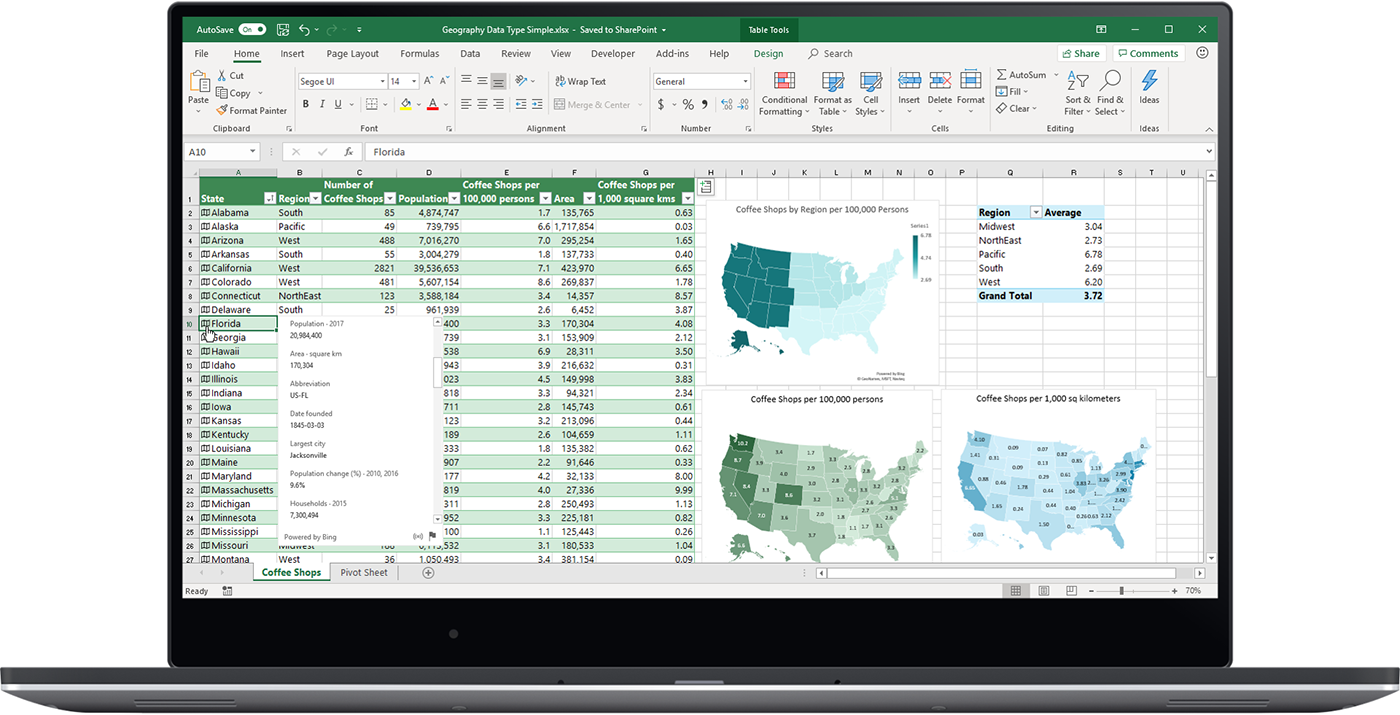
Featured
Data, data, data. It is the core of organizations, driving decisions, strategies, and daily operations. But as the volume of data grows, so does the challenge of managing and making sense of it. One of the most common tools that we fall back on is Microsoft Excel.
While Excel serves well in data entry and tracking and to an extent, even in data visualization, it fails to provide a centralized and unified view of the project. But as data needs scale, and when decision windows shrink from weeks to hours, spreadsheets become brittle. They fragment collaboration, delay visibility, and struggle to show the “so what” behind the numbers.
That is where outcome-driven dashboards come in, providing an eagle-eye perspective of key metrics like earnings, expenditures, pending requests, project progress, and customer status, enabling informed decisions and comparisons between plans and actual performance. Dashboards help close the loop between data and decision-making, enabling course correction and clarity.
Take for instance, a Sales Dashboard built using Apache Superset. Here you can get real time insights, a visualized timeline, fast-selling product models, total revenue made and more, all in one place.
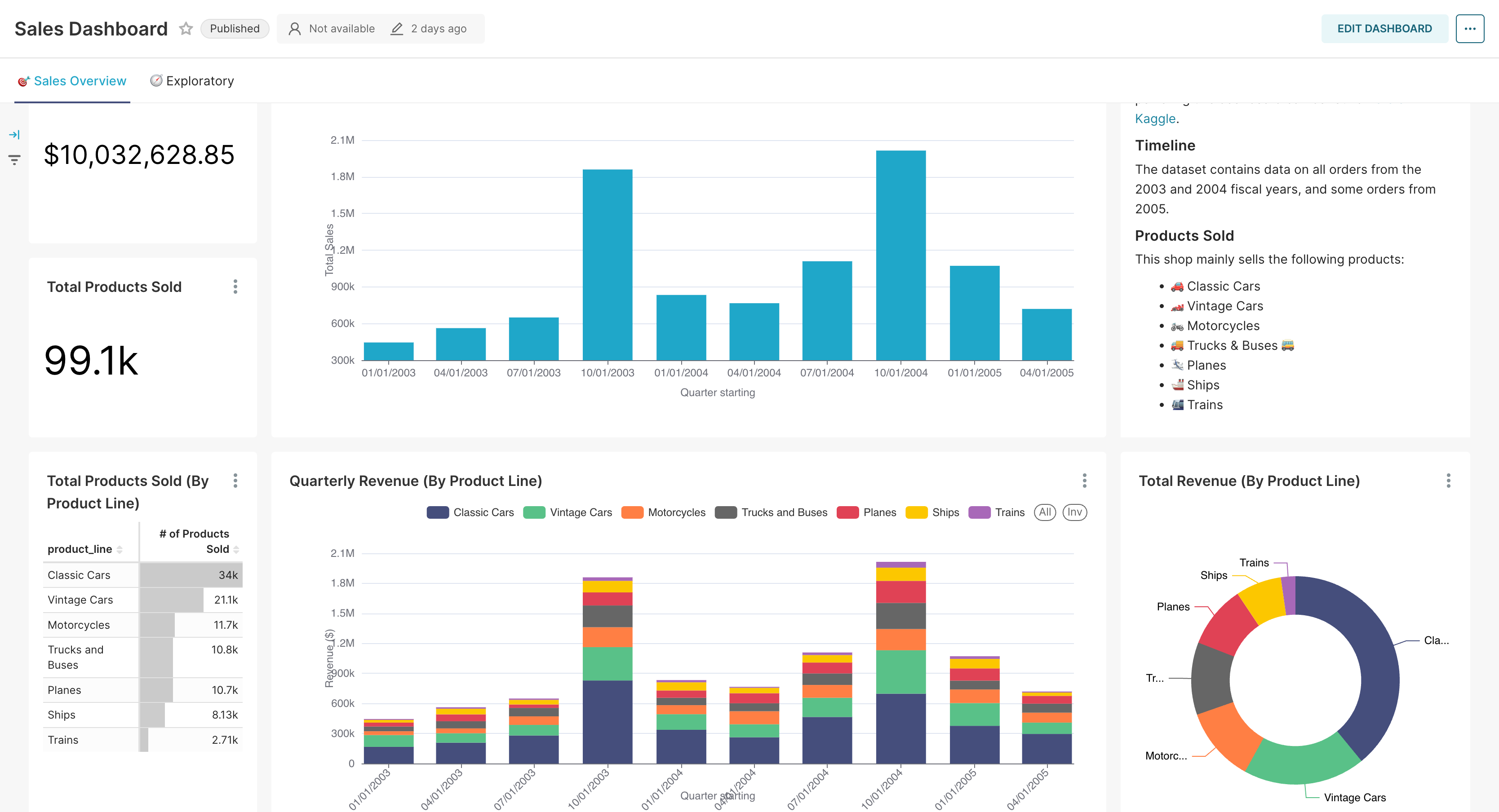
What’s more, Apache Superset can take data from multiple sources and collate it in one place. That is the beauty of making use of a dashboard.
The Flow of Data
Every insight begins as a signal , captured from an app, a sensor, a click, or a transaction. But capturing data is only step one. For it to be trustworthy and timely, it needs a pipeline. Data must be ingested, cleaned, validated, and modeled before it ever appears on a screen.
This process isn’t just technical, it is strategic. Each layer in the flow should answer a business question.
- Which sources matter most?
- How fresh does the data need to be?
- Who needs access?
An effective data flow supports this entire journey: from ingestion to modeling to visualization. And the best ones are designed backwards, from the decision you want to enable, to the metric that supports it, to the data that defines it.
Visualization as a Story
A dashboard isn’t a canvas for showing everything. It is a tool to make something obvious. Too many dashboards overload users with charts, filters, and widgets that try to answer every question at once.
The most effective visualizations begin with a focus:
- What should the viewer understand in the first five seconds?
- Is something off track?
- Is something accelerating?
- Is a trend unfolding?
Visuals should guide the eye, using contrast, motion, and structure to steer attention. Color is not for decoration; it is for signalling. Movement is not a gimmick; it is a cue for urgency.
Dashboards That Drive Action
The true goal of a dashboard is not to inform; it is to move people to action. To align teams. That is why dashboards need to be more than static snapshots. They need to behave like living systems.
Imagine a product launch dashboard that doesn’t just show sales figures, but highlights deviations from forecast in real time. Imagine an operations dashboard where a delay in one region automatically shifts attention to contingency plans. Imagine a stakeholder being alerted not after a report is sent, but the moment a leading metric changes. That is what outcome-driven design looks like.
And at the center of all this is the user, not the analyst or engineer, but the decision-maker. Dashboards should meet them where they are, speak their language, and surface only what they need to act. Everything else is noise.
Building for Outcomes
It is easy to build a dashboard. But building one that actually improves outcomes, that shifts decisions, saves time, or unlocks clarity, takes intention.
Start by mapping the flow backward from the outcome.
- What decision needs to be made faster?
- What behavior needs to change?
- What risk needs to surface earlier?
Only then should you decide what to track, how to visualize it, and how often to refresh it.
You don’t need dozens of charts. You need the right ones, wired to the right data, shown to the right people. And if it feels more like an interface to your business than a summary of it, you have done it right.
Conclusion
The real work of analytics is not in collecting data. It is in shaping it into something that matters, something that moves. Dashboards are the visual endpoint of that journey, but they are also the beginning of something else: accountability, alignment, action.
And when they show movement, progress, and control, they do more than reflect your business. They help shape its trajectory.
Because in the end, outcomes aren’t tracked. They are designed.
At Coffee, we help teams move faster by automating their internal processes, eliminating repetitive tasks and bringing structure to everyday operations.
Reach out to us to build outcome-driven dashboards or explore how we can help optimize your workflows with tech.