Read with Claude
 Read with ChatGPT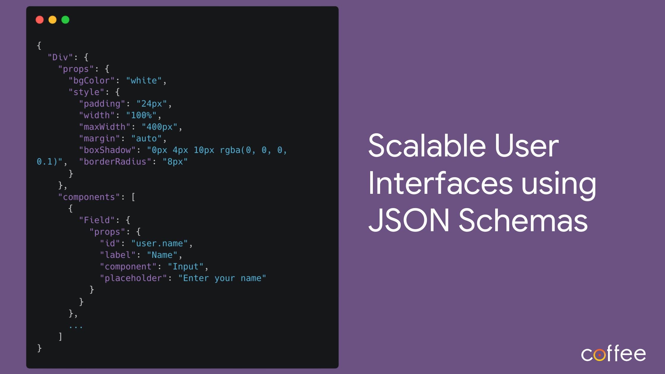
Building user interfaces can be complex, requiring careful planning of component structures, interactions, and behavior. As applications grow, manually managing UI components becomes increasingly tedious and error-prone as you have to go to codebase every time you need to make small changes like changing styles or updating text or even managing layouts.
That is where JSON Schema comes in, acting as a blueprint that keeps everything organized, consistent, and scalable. Instead of manually coding every detail of forms, layouts, or dynamic elements, you can describe them in JSON. This makes UI development easier, allowing teams to focus on defining what the UI should look like rather than how to render it.
A renderer or a specialized “UI builder” then reads this schema and transforms it into a fully functional interface. Developers and designers can work independently. Designers can define the UI structure in JSON Schema, while developers focus on rendering logic and backend integration.
Why Use JSON Schema for UI?
- Consistency: Clearly outlined properties and rules ensure uniform behavior across your app.
- Maintainability: Making changes in one place (the schema) reflects everywhere.
- Scalability: As your app grows, new components or rules can be easily integrated.
- Collaboration: Designers and developers can align more easily when there’s a shared, standardized schema.
- Interoperability: JSON is a widely accepted format that integrates well with different platforms, making it easier to reuse UI definitions across web, mobile, and even desktop applications.
Breaking Down UI into Modular Blocks
To make UI scalable and manageable, we can break it down into modular blocks that can be defined in JSON Schema. These blocks represent different UI components, layouts, and interactions.
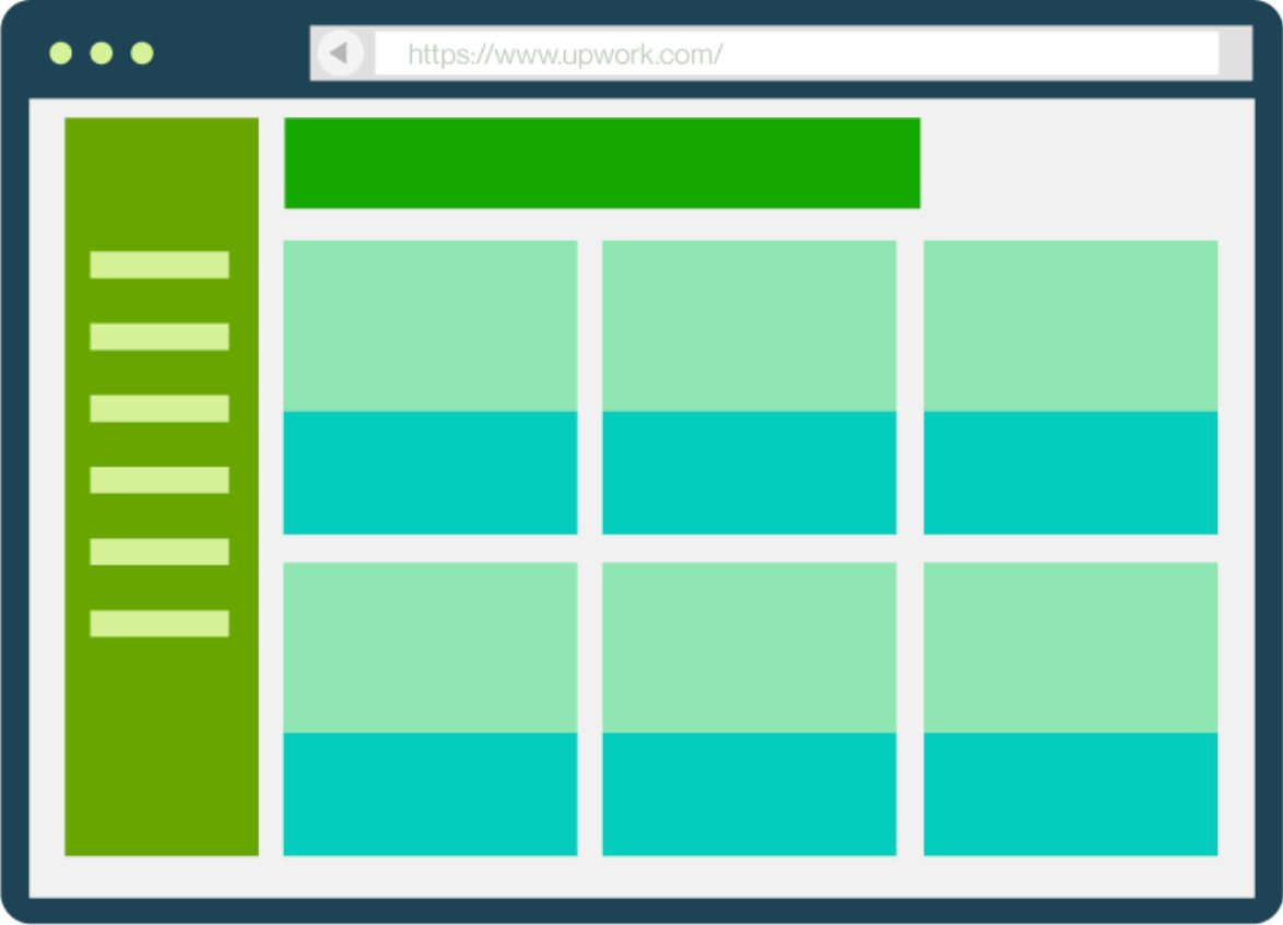
The layout determines how elements are arranged on the page, influencing the flow and user experience. In traditional HTML, you might rely on <div>, <section>, or <header>. With JSON Schema, you can abstract these as “modular blocks” and define them in a reusable format.
1. Container Block
The Container Block groups related components together, managing their arrangement (e.g., div, grid, flex, column).
{
  "Div": {
    "props": {
      "bgColor": "white",
      "style": {
        "padding": "24px",
        "width": "100%",
        "maxWidth": "400px",
        "margin": "auto",
        "boxShadow": "0px 4px 10px rgba(0, 0, 0, 0.1)",
        "borderRadius": "8px"
      }
    },
    "components": [
      {
        "Field": {
          "props": {
            "id": "user.name",
            "label": "Name",
            "component": "Input",
            "placeholder": "Enter your name"
          }
        }
      },
      {
        "Field": {
          "props": {
            "id": "user.email",
            "label": "Email",
            "component": "Input",
            "placeholder": "Enter your email",
            "type": "email"
          }
        }
      },
      {
        "Field": {
          "props": {
            "id": "user.password",
            "label": "Password",
            "component": "Input",
            "placeholder": "Enter your password",
            "type": "password"
          }
        }
      },
      {
        "Field": {
          "props": {
            "id": "user.age",
            "label": "Age",
            "component": "Input",
            "placeholder": "Enter your age",
            "type": "number"
          }
        }
      },
      {
        "Button": {
          "props": {
            "label": "Submit",
            "bgColor": "#28a745"
          }
        }
      }
    ]
  }
}
Here you can see the Div container block with the following props:
- bgColor: Sets the background color.
- style: Custom CSS properties.
- components: Nested elements or child components that will be rendered inside this layout.
2. Input Components Block
Input Components block defines specific UI elements like text fields, buttons, and dropdowns. They form the interactive parts of your interface, where users type, select, or provide data.
We can look at the Field component below with specific props needed for an input field.
{
  "Field": {
    "props": {
      "id": "user.name",
      "label": "Name",
      "component": "Input",
      "placeholder": "Enter your name"
    }
  }
}- id: A unique identifier for data binding and state management.
- label: The text displayed above or beside the input field.
- component: Specifies the type of input (text, password, email, etc.).
- placeholder: A hint inside the input field for guidance.
3. Custom Components
Beyond basic layouts and input fields, you’ll often need specialized components like modals, repeaters, accordions, or complex data tables.
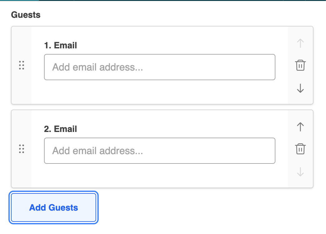
Here is the structure of the Repeater component with component children that can be added as many as required.
{
  "Repeater": {
    "props": {
      "id": "guests",
      "components": [
        {
          "Field": {
            "props": {
              "id": "guests.*.email",
              "label": "Name",
              "component": "Input",
              "placeholder": "Enter guest email"
            }
          }
        }
      ]
    }
  }
}- Repeater: Dynamically replicates a set of fields (e.g., a list of guest emails).
- Inside, each Field follows the usual input props but includes an array-based id (
guests.*.email) to handle multiple entries.
Validation Rules
With field inputs and data, there is always a need for validation rules. They can ensure that a field is required, matches a certain format (e.g., email or phone number), or respects character limits.

These rules can be added as a prop to the input Field.
{
  "Field": {
    "props": {
      "id": "user.phone",
      "label": "Phone",
      "component": "Input",
      "placeholder": "xxx-xxx-xxxx",
      "validation": "[['required'], ['matches', /^\\d{3}-\\d{3}-\\d{4}$/]]"
    }
  }
}**validation**: An array of rules.
requiredensures the field can’t be empty.matcheschecks the input format (in this case, a U.S. phone pattern).
Conditional Rendering
Some UI components should only appear based on user input. JSON Schema supports conditional rendering, enabling dynamic UI changes, like showing a detailed address form if a user selects “Shipping Address.”

With JSON Schema, you can specify conditions that determine whether a component is rendered or hidden. For instance, if a certain checkbox is checked, show additional fields. Otherwise, keep them hidden.
Common Use Cases
- Repeaters: Dynamically showing an additional set of fields after the user clicks “Add more.”
- Radio Buttons: Revealing a specialized form section based on a selection.
- Toggling: Switching between different layouts or themes.
Rendering the UI
Once the JSON Schema is defined, a rendering engine (which can be custom-built or part of an existing library) reads through it and translates each component into an actual UI element. This process usually involves:
- Parsing the Schema: Iterating over each component definition.
- Mapping to Components: Converting JSON properties to the corresponding React, Vue, or Angular components.
- Applying Styles & Rules: Incorporating props like
style,bgColor,validation, etc. - Mounting the Result: Placing the generated UI onto the page or within another layout element.
Conclusion
JSON Schema offers a powerful way to describe and generate your UI, from the simplest inputs to the most complex, dynamic layouts. By centralizing the description of your components, you make your application more consistent, maintainable, and adaptable to future needs.
Whether you are building single-page apps or large-scale platforms, you can create flexible, reusable, and adaptable interfaces without getting bogged down by repetitive coding. With clear structures, validation rules, and conditional rendering baked into the schema, your application stays organized and user-friendly.